by Naples Print Source | April 6, 2024 | Marketing, Printing Techniques, Direct Mail:
In last month’s blog post (March 2024), we discussed how metallic paper can be used to dress up an invitation, envelope, folder or other marketing piece, transforming it from basic into what might be described as powerful and stunning.
Similarly, metallic ink or foil is an incredible tool to draw a contrast and capture the viewer’s attention to your printed piece.
Be aware that the effectiveness of metallic ink is highly dependent on the paper stock that is selected. More specifically, metallic ink tends to lose most of its metallic qualities when it is printed on uncoated paper. For this reason, we seem to use foil instead of metallic ink on the majority of our projects because the foil maintains the same brilliance regardless of the type of paper used.
One way to effectively use metallic ink to draw attention to your printed piece is to contrast the metallic ink with the color of paper, as done in these examples:
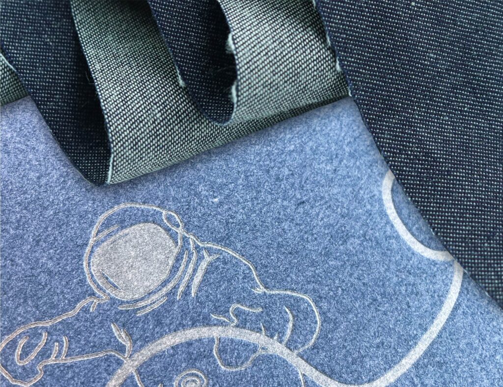
metallic silver on recycled denim:
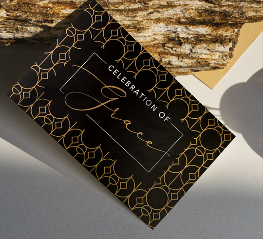
art deco-style invitation with metallic gold ink on black paper:
bi-fold holiday card with metallic silver on red stock:
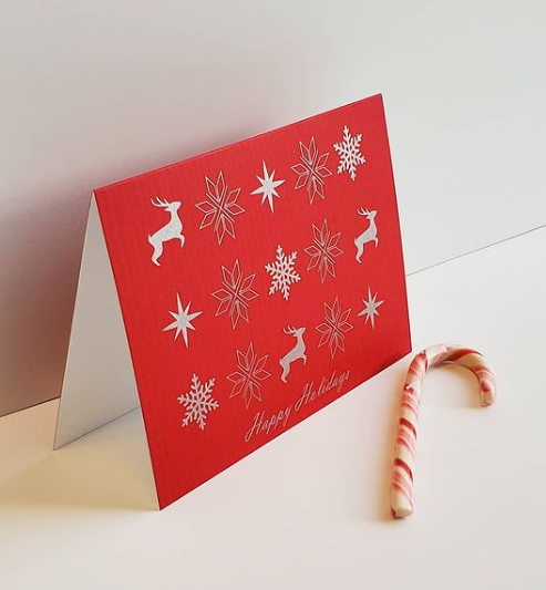
While in the above examples the metallic color does not appear shiny, the contrast with the color of the paper still makes the printed piece compelling.
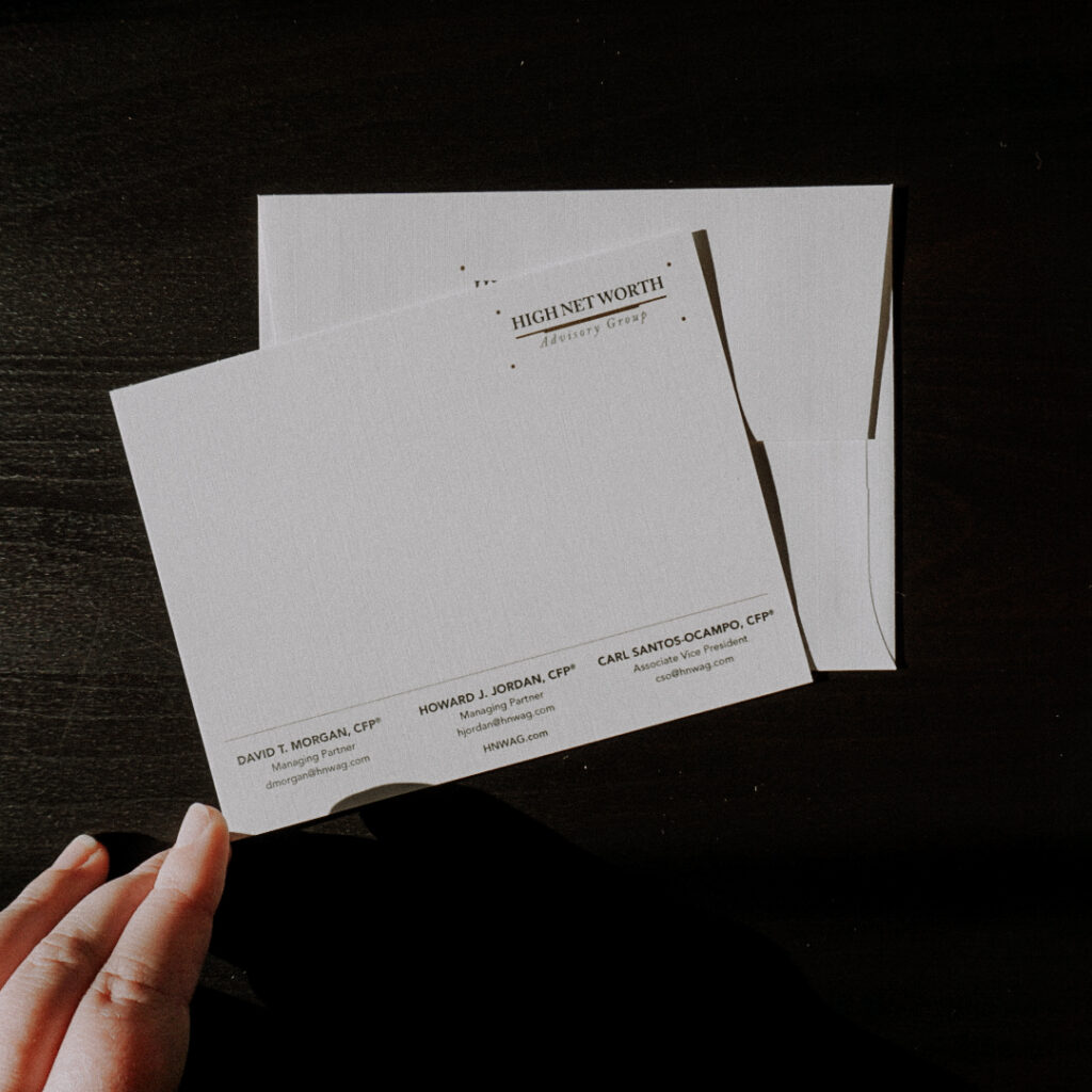
Metallic ink on a white, uncoated paper is even more understated as seen in these examples:
metallic gold ink (not Letterpress, but regular offset printing) on a note card:
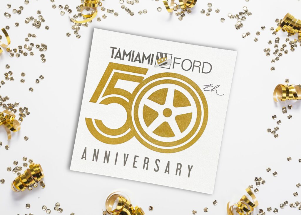
metallic gold ink on uncoated paper. In this case, it is Letterpress:
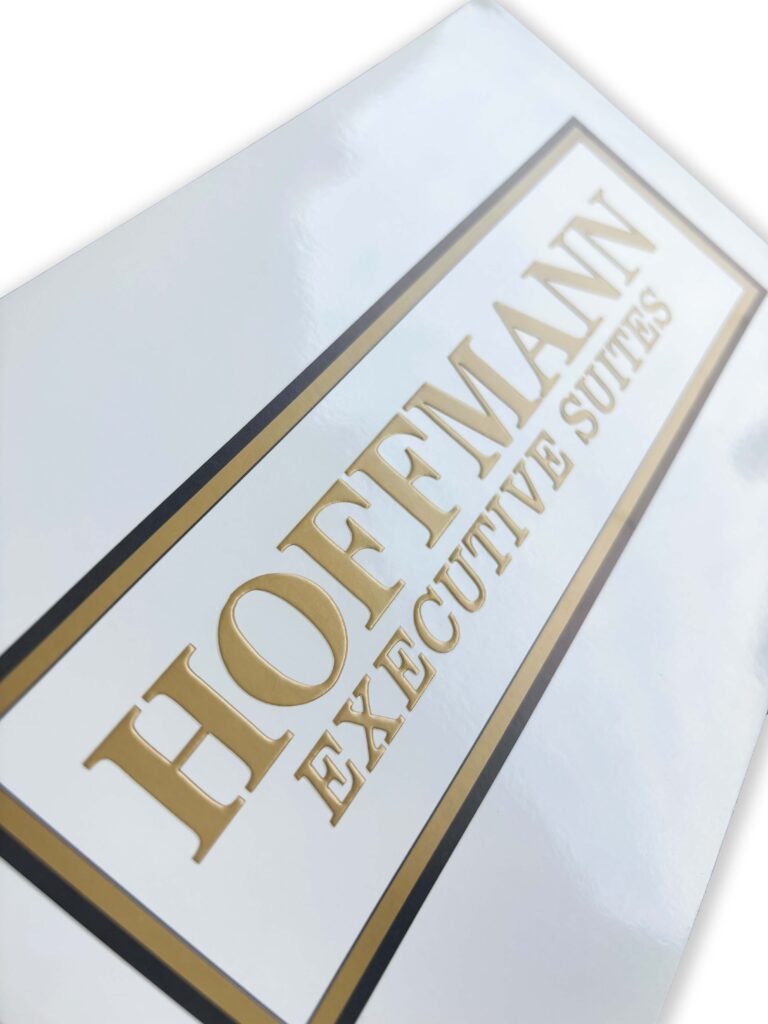
The reflective qualities of metallic ink will be most noticeable on coated paper as seen in this book cover example:
In my opinion, since foil is so much more reflective, it should be used more sparingly.
Again, the magic is in the contrast, and too much foil does not provide the necessary contrast:
In this example, you can see the contrast between the gold foil and blue ink:
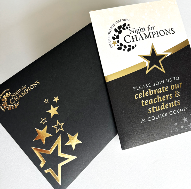
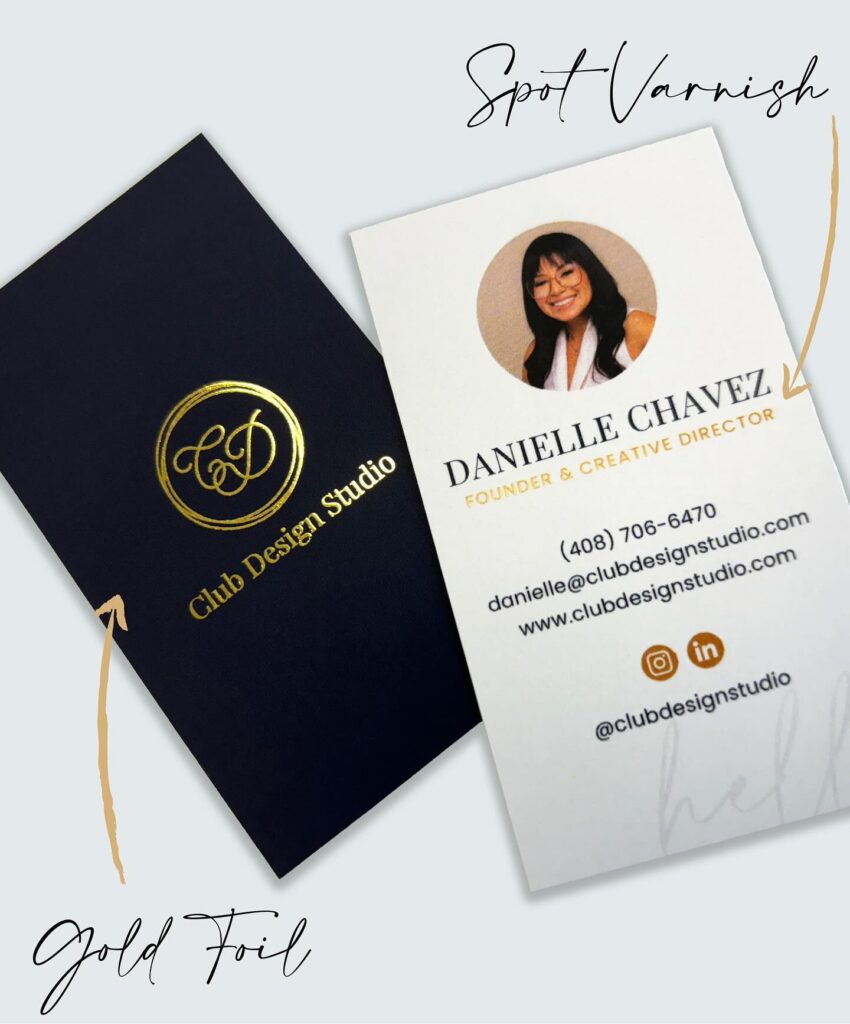
This black envelope shows powerful contrast between the gold foil:
Finally, dramatic contrast with black and raised silver foil on this business card:
A final point worth mentioning is that with the advent of digital foil, it can be used for projects produced in smaller quantities, or projects that require a quick turn-around time. Here are two examples we recently produced:
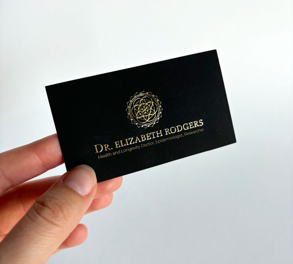
digital gold foil business cards:
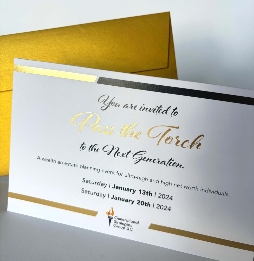
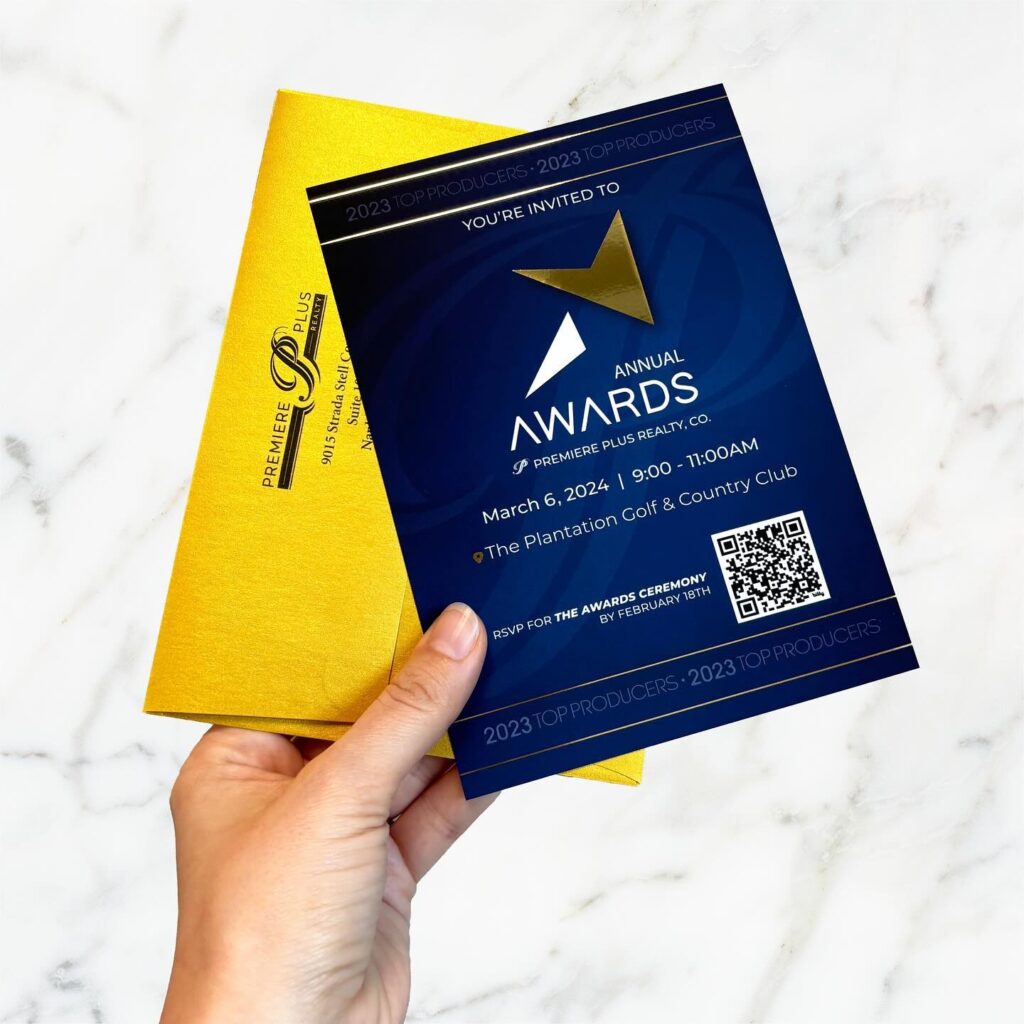
digital gold foil invitations:
This also means it is essentially faster and less expensive to produce short-run foil projects than it is to use metallic ink. This is another reason why foil may be a better solution than metallic ink for some print projects.
As you can see, there are many options for you to consider. It can get confusing. It also can be difficult for you to keep up with printing trends and new techniques. Let us do that work for you. When you are ready to begin planning your next marketing project, reach out to us so we can discuss how metallic ink or foil can be used to create a piece that stands out, gets noticed, and achieves your goals.
Schedule a Consultation or Contact Us today. If you’d like to see more examples of our work, please check out our Instagram page.